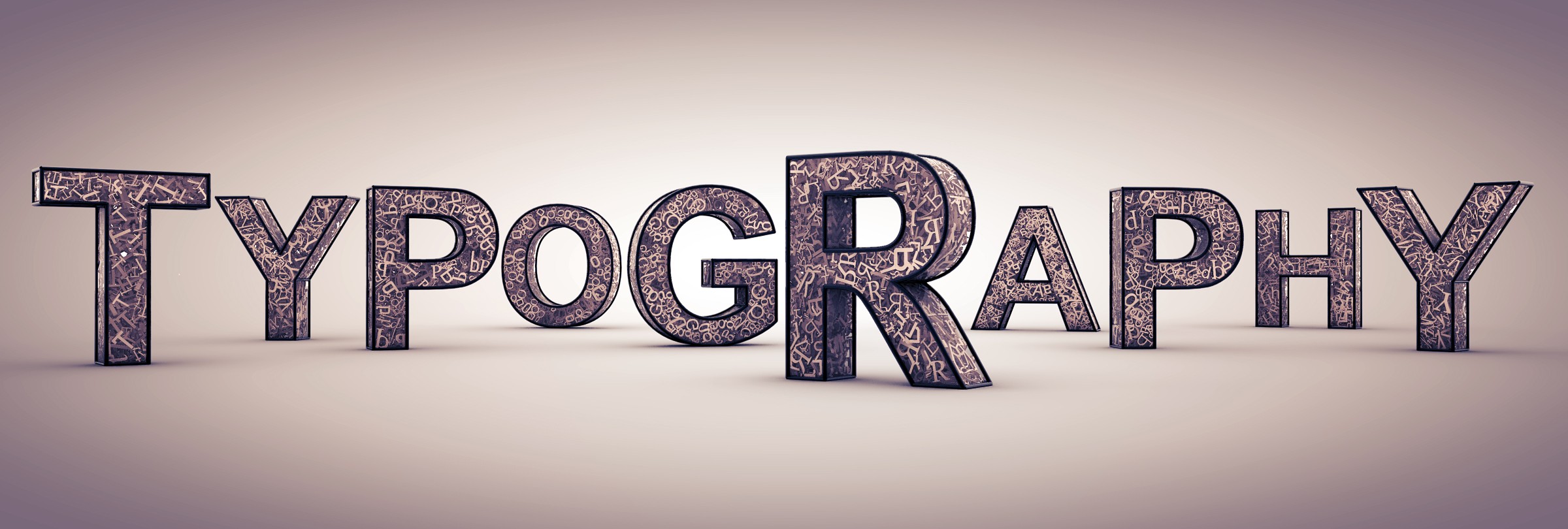
TYPOGRAPHY:
My initial ideas were:
- The use of flowers
- Sanremo’s train station
- Poor gastronomy
- Rally
I wanted to either combine those topics or use them individually to my typography postcard. I liked the shape of the tires and began to think of interesting ways of representing them so I started my A1 work sheet!
Just when I began to develop my ideas on the sheet we had a project review meeting with Karl where we sat on the table and talked about our work to other colleagues and they would give us ideas/ things we could improve/ positive critics about our work which I found it was tremendously helpful that time because I was feeling a bit lost. As I presented my work these were the suggestions I got:
- city of flowers + metal materials combined (eg: flowers from metal)
- paint in style of Italian painter (boccioni???)
- flowers with colors from cars (rally)
- tires could be used as the middle of the flowers
Later on I started to develop the ideas that were giving to me and my own combined as I would search for typographers as well. I took a look at some artists that ended up inspiring my final work:
- Eric Gill – He was mainly typographer and sculptor but what fascinated me about him was the way he uses lettering to create shapes in order to send a message.
- Neville Brody – From what I’ve searched of him he developed a whole new language “that consisted of a mixture of visual and architectural elements” but what really captured me was how his thinking behind the project is present in the project itself!
- Herb Lubalin – Again, his beautiful lettering to form shapes, the way he plays with the word’s meanings and how he represents them.
My sheet along the project:


After I completed it I had more or less the final idea. However I still did some color experiences on my sketchbook:


I didn’t think that any of these ideas worked 100% so I decided to not use either the black background or the text saying “THE CITY OF”
And finally my final typography postcard!


5 thoughts on “Typography Postcard”
Lovely!
Congratulations Maria, I love ways and how you can mix things/concepts and create! Send it to the Sanremo Rally organization… 👌