To make our glass pieces we had to choose one image. It could be the same as the one we used to make the clay (when we turned 2D into 3D) or another one.
I personally like a lot of Portuguese artists so I thought about using one. I ended up with 2 artists and two pieces:
- David Oliveira – He was born in Lisbon (the place where I come from) and he’s one of my favorite sculptures. Here’s how people describe him: “David Oliveira was born in Lisbon in 1980. He holds a degree in sculpture from Lisbon University and since 2005.Exploring the idea of line and space, Oliveira plays on optical illusion. Two dimensions become three dimensional works of wire art. His wire sculptures evokes the appearance of a sketch suspended. Fashioned only in line, the viewer fills in the space to see the character beyond. His work has featured in Arte Lisboa, a national art fair which brings together works from contemporary and modern art galleries.”
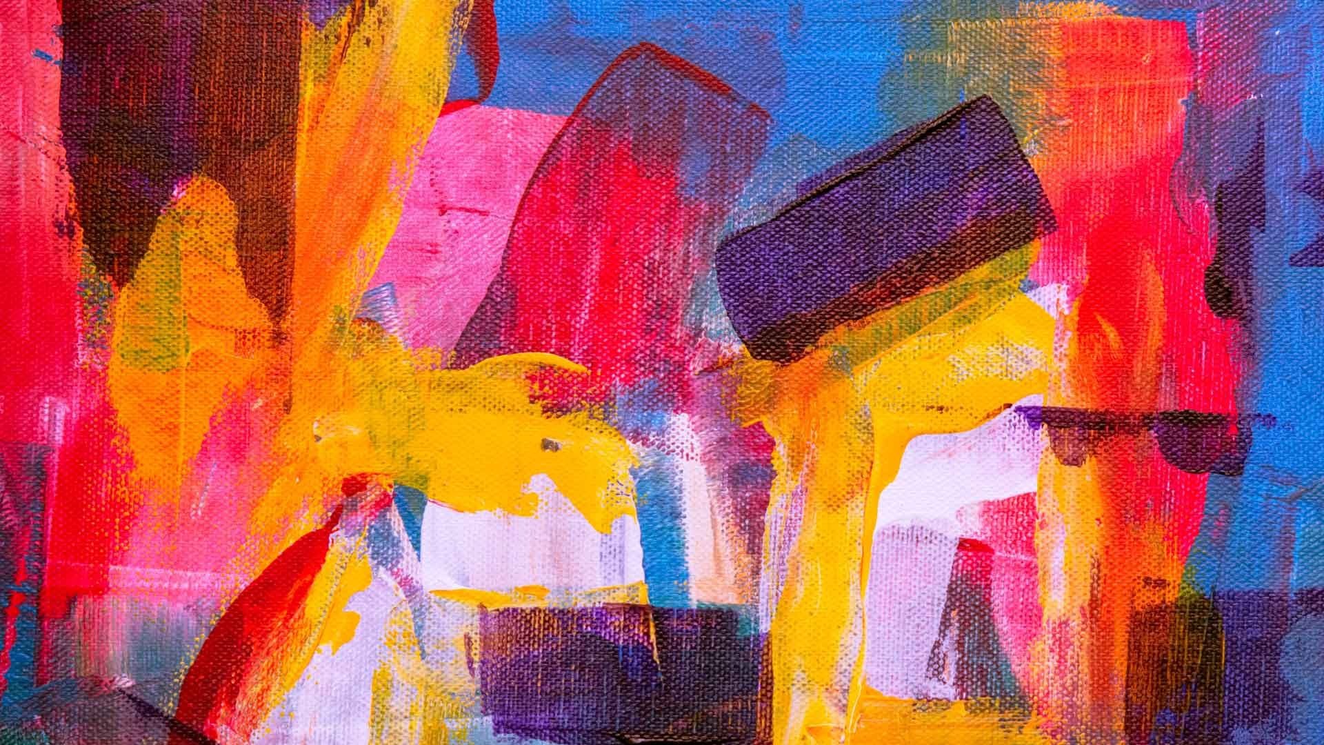
- Helena Vieira Da Silva – I love her style and geometric shapes, here’s the image I chose. I have been to two of her expositions in Portugal and the paintings are just amazing. The little squares we see on the paintings, the first thought would be that she draws the contour and then paints the inside but no. Vieira da Silva always starts squares on their center and then she paints them from there but I guess it gets perceivable once you know, amazing.
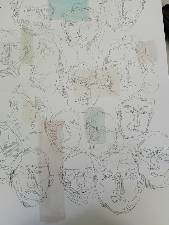
So I took the two images above to inspire my glass work and started my A1 sheet to develop them into something more mine. Here is the result:

What interested me the most about David’s work on this piece was the use of the thin line, it’s beautiful. About Helena’s work I just love the effect that her paintings have. Her paintings remind me of buildings, cities, people and that’s what she mainly paints but in this abstract almost non abstract way through lines and squares!
So I did some experiments (on the right side of the sheet) where I drew a lot of different people trying to use David’s approach, just line and without taking my pen off the paper combined with some really soft squares (Vieira Da Silva’s mark). On the left side of the sheet I just tried to understand how both artists approach their art.


